Following from where I left off in my data collection phase, I need a way to view my data while on my mac. I usually never have my RPi connected to a display, but rather ssh in. I was thinking about making a live update graph from a javascript library and hosting it on the RPi, but, then I realized that I was only collecting 1 datapoint every 6 minutes (a built in characteristic of Transmission) and thought that it would be overkill, especially since I would only want to see the graph while I was on the same local network.
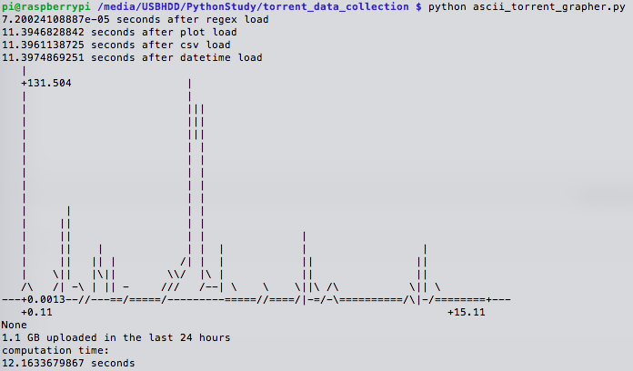
I settled on a module that is a part of scitools, called aplotter, which makes an ascii (not an image) plot, because it would be able to make a plot straight in the same terminal session, and because my demands are more qualitative when it comes to the graph.
My Script (a link to the one I use here) got a few things done:
- Used regex to parse the strings I had saved in a csv and extracted time and byte strings
- CSV specific:
with open(data_input_path, 'rb') as csvfile:raw_torrenting_data = csv.reader(csvfile, delimiter=',')- then you have each line to work with, and then element within that line
- straightforward:
re.search(pattern, source), then use groups to extract elements - would sometimes get a method NoneType error when the parse failed, sometimes for questionable reasons and sporadically, so I introduced a condition the avoid these datapoint errors
if str(type(parse_data_point)) == "<type '_sre.SRE_Match'>"
- CSV specific:
- turn string times into time objects
datetime.datetime.strptime(string_a, '%Y-%m-%d %X')- can subtract time objects no problem
- but working with the deltas is interesting, it only stores days, and then leftover seconds, so you can query days and seconds only
hour_difference = (4 + diff_obj.days * 24 + (diff_obj.seconds/3600.))
- Did the derivative of the cumulative count of uploaded bytes
- shifted one list, and subtracted their elements
- slice notation was interesting
original_data = array_of_string_nums[1:]- leaves off the first element, 0th index
offset_data = array_of_string_nums[:-1]- leaves off the last element
- Made converted bytes more readable
- Made the graph for the last day
x = x_axis[-145:-1]y = y_axis[-145:-1]scitools.aplotter.plot(x, y)
What it looks like:
Good enough! Can see whether uploading is going well, or not at all. Notice that all the time is spent loading the library for the plotter!
- I found this out by inserting:
import time ; start_time = time.time()at the beginning, and thenprint time.time() - start_time, "seconds after whatever"intermittently
Things to fix later:
- see if its possible to use another library thats quicker, or some workaround
- parse command line arguments to plot more than just the last 24 hours
- consider prettier graphs like the python port of chartkick
